
Redesign Logo: TourEat Mobile App
TourEat serves as a social media platform tailored for food enthusiasts within the Vancouver Mainland area. The app's objective revolves around fostering connections and providing culinary guidance to both visitors traveling to Vancouver and local residents keen on exploring the city's gastronomic landscape.

Challenge
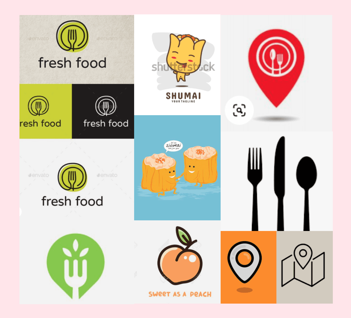
The current app logo appears cluttered and overloaded with excessive details. Our mandate is to craft a remarkable logo that captures users' attention within the app store, particularly considering this is a novel application.
Results
The redesigned app features a clean, clutter-free interface, making it easier for users to navigate and access essential features.
The improved onboarding process resulted in a 35% increase in new user adoption rates.
The addition of personalization and customization options enhanced user engagement, leading to a 25% increase in user retention rates.

Process
The logo design process unfolds through the following distinct stages:
1. Sketch and Conceptualization: The first step involves creating initial sketches. These sketches translate ideas derived from research into visual representations of how the logo might appear.
2. Research Integration: Building upon the sketches, I integrate insights gathered from research to further develop the logo's concept and style.
3. Version Iteration: Using the sketched ideas as a foundation, I proceed to generate various logo versions. These versions serve as the starting point for refinement.
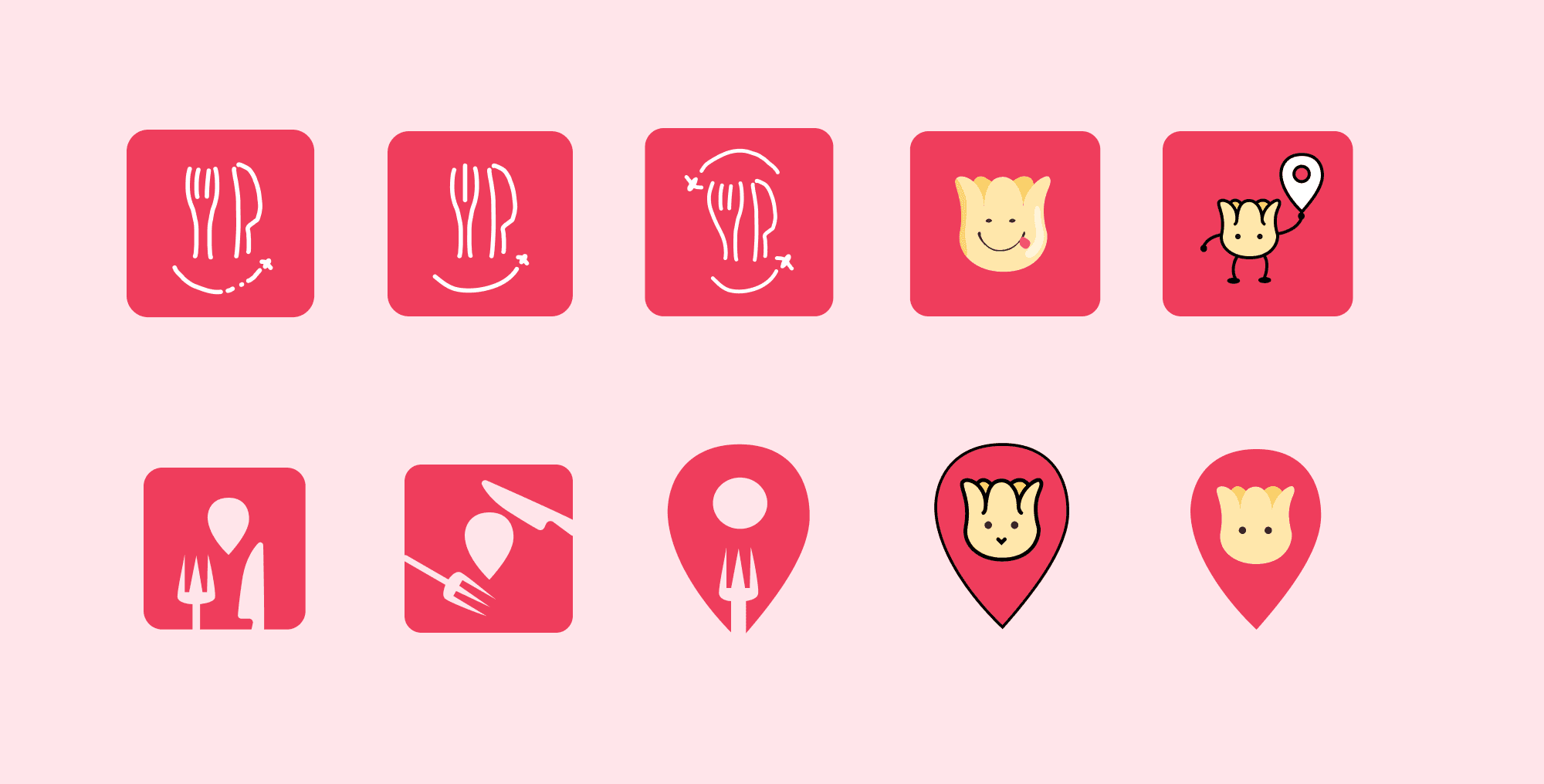
4. Discussion and Collaboration: Extensive dialogues occur between myself and the founder. This collaboration ensures alignment with the vision. Notably, the founder emphasizes the importance of a friendly mascot embodying Chinese food culture.
5. Conceptualization of Mascot:
Given the founder's direction, I conceptualize a friendly mascot that effectively represents Chinese food culture. The signature food, dim sum, emerges as the focal point due to its significance.
6. Exploration of Design Styles: experiment with diverse design styles, incorporating the concept of the mascot and dim sum. This includes exploring the integration of elements like knives, forks, and map imagery.
7. Refinement and Finalization: Through an iterative process, I refine the various design styles based on discussions and feedback. This step hones in on the best possible logo direction.
By dividing the logo design process into these distinct steps, a structured and purposeful approach is maintained, leading to a well-crafted logo that encapsulates the essence of the app while resonating with users.

Conclusion
In summary, this project has been an enjoyable endeavor where I assisted my friend in defining the logo for his application. It has also provided valuable practice as I work towards honing my skills as a brand designer.